Last week we lamented the deplorable state of most About Us pages. This week, it’s time to pick on everyone’s least favourite page, Contact Us. Marketers, pay attention here: I know you went and found that swell stock photo of tin cans and string. I know you came up with the perky “We’d love to hear from you” copy at the top. Good job. I’ll bet you left all the rest of it to someone else, didn’t you? You left the room when it was time to start figuring out all those phone numbers and addresses, and embedded maps from the airport and different emails and forms with their mandatory fields. You let the Productivity Prevention Department or some designer dude handle that mess, didn’t you?
After all, nobody likes the Contact Us page. Someone might actually, you know, contact us. And we certainly can’t be having any of that. Well, except for the new business. We like it when new business contacts us but not any new business – only the kind we are going to like having as clients. You’ll be wanting to screen out the ones who are whiny, don’t pay on time, want help with things, can’t figure out your billing statements. Better make a form.
People, marketing is a conversation, and Contact Us pages, just like Facebook and Twitter, are where that conversation starts. Just because you don’t want to have a talk with an unhappy customer, a job-seeker, an investor, a regulator, a supplier or other time-waster, doesn’t mean that conversation shouldn’t happen. I suggest it’s kind of our job to let that conversation happen and to help it happen quickly and productively. Ideally, also in someone else’s budget (which is a lot of the reason we suck at conversations). There are two categories of things that probably suck about your Contact Us page: the way you set it up and the way you manage the processes it creates.
Things You Can Do to Make The Contact Us Page Not Suck:
Recognize that social media are the other Contact Us pages
Contact Us pages were mostly designed in an era when phone, fax and email were the only real-time ways to have a conversation. Does your page link to all your social feeds? More importantly, are the people who can help the people who don’t use phone and email actually on these platforms? If the only people having conversations on social media work in sales and marketing, you are doing it wrong. Make sure your Customer Abuse and recruiters know how to use your social platforms. Also, if you have a fax number on your Contact page, you might want to double check that you still have a working fax machine someplace.
Get a live chat function
Chat is two to three times more productive than live phone calls, and for most people it’s a reasonable substitute for voice. In fact, if you’ve been getting complaints about accented CSRs who “don’t speak English” a live chat can be great work around. Even GM Canada has a live chat function. Do you have a live chat function? Why don’t you have a live chat function?
Make it work on mobile devices
I can’t believe I have to tell you this. Make the page (and the chat) work on mobile.
Solve your visitor’s problem, not your problem
Most Contact pages are set up to solve the brand’s problem (like too many people saying unkind things) and not the person who is on the page’s problem (like, I want to automate my warehouse or I would like to work for you or I want to visit your location). Design it from the point of view of what the visitor needs to accomplish and it will suck a whole lot less.
Make it easy to do the right thing
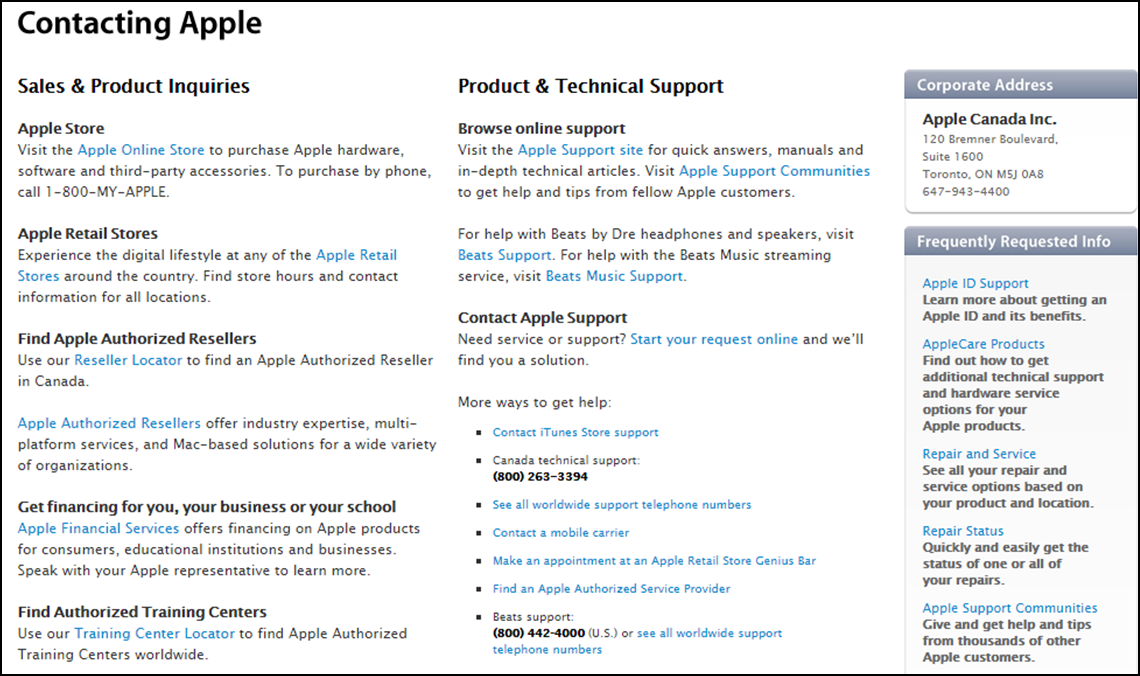
When you look at why sales is rejecting web leads, I will bet you find a lot of job seekers, customers, vendors and crazy people in the pile. Sales should reject these leads and you should stop letting this sort of thing get through to your Squirrels in the first place. The reason people send resumes, solicitations and hand-drawn pictures of the spiders in their heads to your sales team is because you have made it hard to send them anywhere else. If your page looks anything like this mess from Apple, it’s no wonder all the wrong stuff is going to all the wrong places.
Make it right to do the easy thing
I’m not a big fan of contact forms, but I accept that sometimes they are the best way to move things along. Why are people calling you when they could fill out the form? Sometimes it’s because the form is making them very, very angry. Look for ways to reduce friction on your forms. Accept multiple formats of phone numbers, use ghost text in the fields to help visitors out, allow for out-of-country address formats, show them errors as they go – please don’t make your visitors wait until they click submit and then play find-the-error on your damn form. At the very least, reduce the number of fields to three or four or, better still, get rid of the forms.
Get rid of the forms
I know, I know. The forms are awesome and they parse the info just right so it goes to the right place. That assumes that there are people so desperate to do business with you that they will put up with mandatory fields, check boxes, drop downs and all that so that you are not inconvenienced by having to read and understand the problem they are trying to solve. I don’t know about you, but I would much rather give my money to a brand that is interested enough to read and understand my problem, especially if my problem is them. Will you get junk? Yes. Will crazy people bother you? Yes. Will resumes land here? Yes. Suck it up and have a conversation.
Let your customers talk to you
That’s the entire point of this page, in case you missed it. Instead of spending your valuable time making up ways for your customers to “self serve”, build “communities of interest” or download 357 pages of documentation, why not help them connect with a human inside your organization. Then that human can respond or find another human who can respond and the whole thing is, well, human.
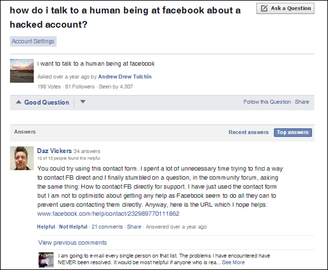
Facebook is famously difficult to speak to, and prefers to let its customers swirl about in online communities where the hottest topic is how to get in touch with, you guessed it, a human.
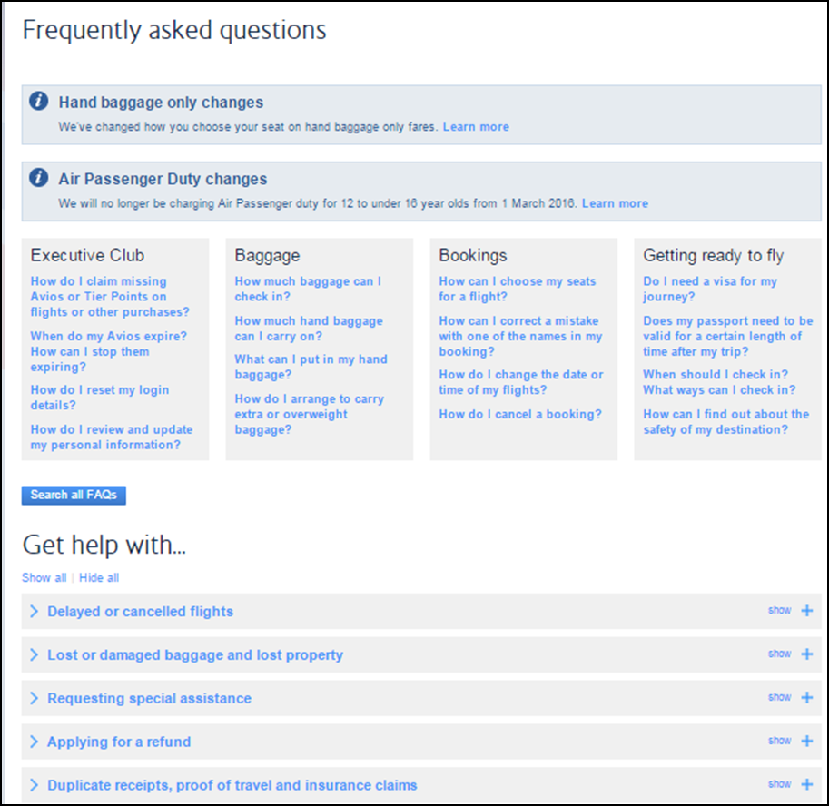
British Airways prefers to serve up a giant mess of pre-chewed questions in scary drop downs that won’t let you click submit unless you find your question amongst the many hundreds on offer. Not a human in sight.
By the way, if you are a major brand that does not like it when your humans talk to human customers, you may want to check this site and make sure they haven’t figured you out.
Check the mailboxes
The most common complaint about online enquiries is that nobody ever responds. One reason is that you don’t have enough people but the other, and in my experience, the more common, is that it is not anybody’s job to go through the inbound messages. Usually these are emailed to a box called “Marketing” or “Contact”. Make sure someone is responsible for checking this box every, single day and dealing with the stuff in there. This is where sales should be directing the rejected leads.
Answer the phone
If there is a phone number on your website, it needs to ring someplace and it needs to be answered and, ideally, the experience that awaits when it is answered, needs to be really good and not an IVR nightmare. Also, pay for a toll-free number or set up Skype. It’s disgraceful how many companies attempt to gate their inbound calls by making their customers pay the long distance charges. First, long distance is more or less free these days, anyway and second, is that really the message you want to send to people who give you money?
Be nice
Live up to the perky copy at the top of the page. Some companies, like this one advocate using filters to weed out “problem clients” in the lead form. Perhaps in their business there are so many great clients that those pesky problematic ones need to be relegated to the competition, but I think a better policy is to make it easy for them to explain their problem, engage them human-to-human to properly understand it and then be honest if you don’t think you can solve it.
One more thing, check the links.
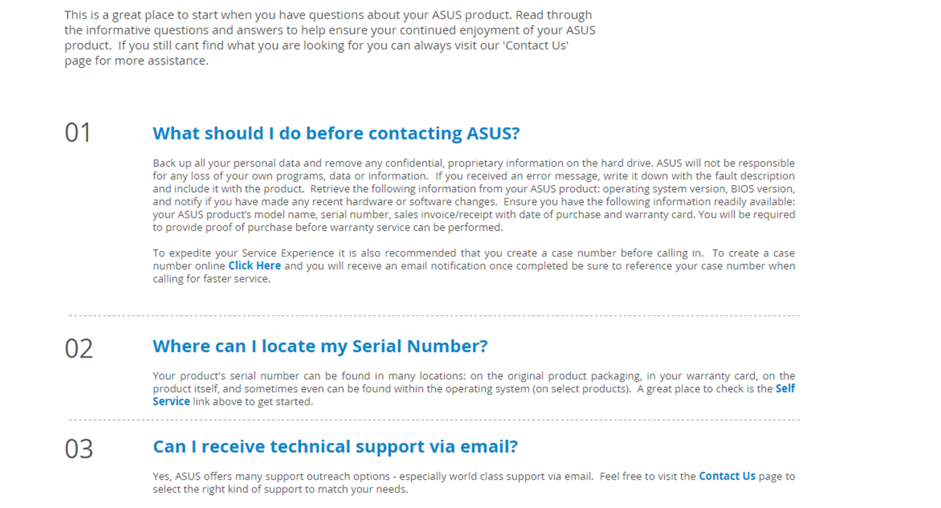
This page from ASUS is full of helpful links to helpful things and not a single link works. Not one.
Related Posts:
This Old Website
Fixing Your Sucky Website
Interesting Things I Found This Week
Soheil Rezayazdi is back on McSweeny’s with a hilarious list of nihilistic security questions. Time to change my passwords again.
I don’t usually consider political noise to be real marketing but here is a brilliant video by Matt Masters Burgener that has me reconsidering. Whether you’d vote for the guy or not, he gets full marks for this video.
BizMarketer is Elizabeth Williams
You can reach me at escwilliams@gmail.com
or follow me on Twitter @bizmkter


Leave a Reply
You must be logged in to post a comment.